Imagine walking into a room painted in a vibrant shade of yellow. Instantly, it feels like the sun just decided to throw a party. Color isn’t just about aesthetics; it’s a powerful tool that can influence moods and behaviors. In the world of interior design, understanding color psychology can transform a dull space into a sanctuary of creativity or a cozy retreat for relaxation.
Understanding Color Psychology
Color psychology plays a crucial role in interior design. Choosing the right colors can significantly enhance a space’s mood and functionality.
The Basics of Color Theory
Color theory serves as the foundation for understanding how colors interact. Primary colors, like red, blue, and yellow, mix to create secondary colors such as green, orange, and purple. Tertiary colors, formed by mixing primary and secondary colors, expand the palette further. Complementary colors sit opposite each other on the color wheel, creating contrast and vibrancy. Analogous colors, located next to each other, provide harmony and subtlety. Familiarity with these concepts aids in making strategic color choices that resonate with intended emotions and enhance overall aesthetic appeal.
Emotional Responses to Colors
Colors elicit various emotional responses, impacting human behavior and perception. Blue often evokes feelings of calmness and tranquility, making it suitable for bedrooms and meditation areas. Red, known for its energizing effect, can stimulate excitement and passion, often utilized in dining or entertainment spaces. Green represents nature, promoting relaxation and balance, ideal for living areas or home offices. Yellow brings feelings of happiness and optimism, suitable for kitchens or playrooms. Understanding these emotional responses enables designers to create environments that align with the desired atmosphere and activities.
Importance of Color Psychology in Interiors
Color psychology plays a crucial role in interior design, influencing how spaces feel and operate. Understanding the impact of color can transform a room’s ambiance and functionality.
Creating Ambiance and Mood
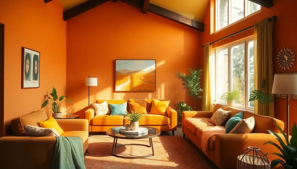
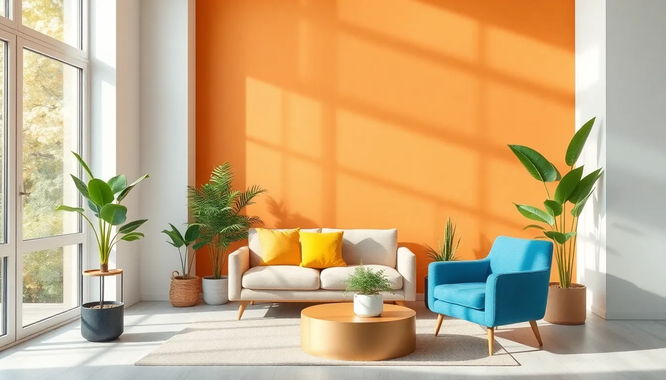
Colors set the tone in any interior space. Warm tones like red, orange, and yellow energize a room, sparking creativity and enthusiasm. Cool tones such as blue, green, and purple promote calmness and relaxation. Neutral colors, including white, gray, and beige, foster a sense of balance and simplicity. Recognizing these effects helps designers craft environments that enhance the intended atmosphere, catering to a space’s purpose and the occupants’ emotional needs.
Influence on Behavior and Productivity
Color also affects behavior and productivity. Studies reveal that blue promotes focus and concentration, making it ideal for workspaces. In contrast, yellow sparks creativity and optimism, encouraging innovative thinking. Spaces painted in green can enhance overall well-being and comfort, making them suitable for break areas. Selecting appropriate colors according to their psychological effects empowers designers to create spaces that optimize productivity and enhance the occupants’ experience.
Color Choices for Different Spaces
Understanding color psychology aids in selecting appropriate shades for various interior spaces. Each area serves a distinct purpose, making color choices vital for enhancing mood and functionality.
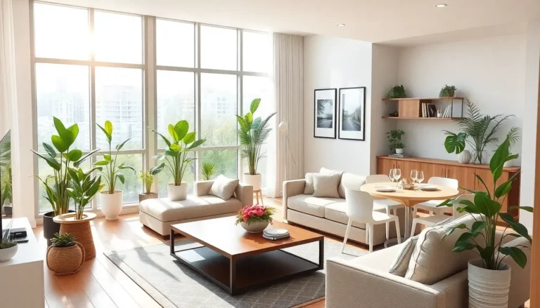
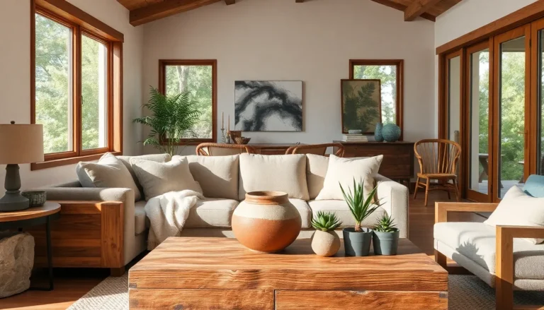
Living Rooms and Common Areas
Warm tones like orange and yellow create inviting and communal atmospheres. These colors encourage conversation and foster social interactions. Neutral shades, including beige and gray, provide a backdrop that allows colorful accents to shine. Using deep tones such as navy or forest green adds sophistication while maintaining comfort. Ultimately, selecting the right palette enhances family gatherings and boosts overall enjoyment.
Bedrooms and Personal Spaces
Soft hues like lavender and light blue promote relaxation and tranquility in bedrooms. Incorporating these shades can help foster restful sleep and soothe anxiety. Earthy tones like soft greens or warm browns create an intimate feeling, allowing for personal reflection. Darker colors, when used sparingly, can add drama while retaining serenity. Prioritizing these selections contributes to restful retreats and personalized sanctuaries.
Workspaces and Offices
Calm colors like blue and green are beneficial for concentration in work areas. They help reduce stress and enhance productivity. A touch of yellow can stimulate creativity and add a cheerful vibe. Utilizing color blocks or accent walls in neutral tones can strike a balance between inspiration and focus. Careful consideration of color within professional environments promotes efficiency and well-being.
Case Studies in Color Psychology
Color choices in interior design significantly influence moods and behaviors. Examining real-life applications of color psychology illustrates its effectiveness.
Successful Interior Designs
A well-designed office often incorporates blue tones to enhance focus and calmness. Professionals report increased productivity in spaces with soft green hues that promote relaxation. Restaurants frequently use warm colors like red and orange to stimulate appetite and create inviting environments. In residential settings, living rooms that feature earthy tones provide comfort, enticing social interactions. Careful selection of colors aligns with the intended atmosphere, driving engagement and satisfaction.
Lessons Learned from Color Implementations
Case studies demonstrate the power of color choice in transforming spaces. Implementing yellow in educational environments motivates creativity and engagement among students. Observations show that incorporating neutral tones in bedrooms fosters tranquility and restful sleep. Designers learned that combining vibrant shades with subdued ones can strike a balance, enhancing visual interest without overwhelming occupants. Each project’s outcomes highlight the importance of understanding emotional responses to color, guiding more effective space design.
Understanding color psychology is essential for creating spaces that resonate with their intended purpose. By thoughtfully selecting colors, designers can influence emotions and behaviors effectively. This knowledge empowers them to craft environments that not only look appealing but also promote well-being and productivity.
As trends evolve and preferences shift, the principles of color psychology remain timeless. Whether it’s a calming blue for a workspace or a vibrant yellow for a creative area, the right color choices can transform any interior. Ultimately, embracing these concepts enhances the overall experience of those who inhabit these spaces, making color an indispensable tool in interior design.