Choosing the right interior color scheme can feel like a high-stakes game of chess—one wrong move and you could end up with a living room that looks like a circus tent. But fear not! With the right palette, transforming a dull space into a vibrant sanctuary is easier than finding a cat video on the internet.
Understanding Interior Color Schemes
Selecting the right interior color scheme plays a critical role in creating a desired atmosphere. Subtle variations in color can significantly influence emotions and perceptions.
The Psychology of Color
Colors evoke specific feelings and reactions. For instance, blue creates a calming effect, making it ideal for bedrooms. Red stimulates energy, perfect for social spaces like living rooms. Green connects with nature and promotes tranquility, suitable for home offices. Yellow enhances mood, injecting positivity, and warmth into kitchens and dining areas. Careful color selection can lead to an environment that reflects personal style while also influencing behavior.
Color Theory Basics
Color theory provides foundational knowledge for creating pleasing palettes. Primary colors include red, blue, and yellow. Secondary colors, formed by mixing primary colors, include green, orange, and purple. Complementary colors, which sit opposite each other on the color wheel, enhance contrast and visual interest. Monochromatic schemes utilize various shades of a single color, producing harmony without overwhelming the senses. Understanding these principles helps designers and homeowners develop cohesive interiors.
Popular Interior Color Schemes
Interior color schemes play a critical role in defining a space’s mood and feel. Popular schemes offer distinct aesthetics that cater to various tastes and preferences.
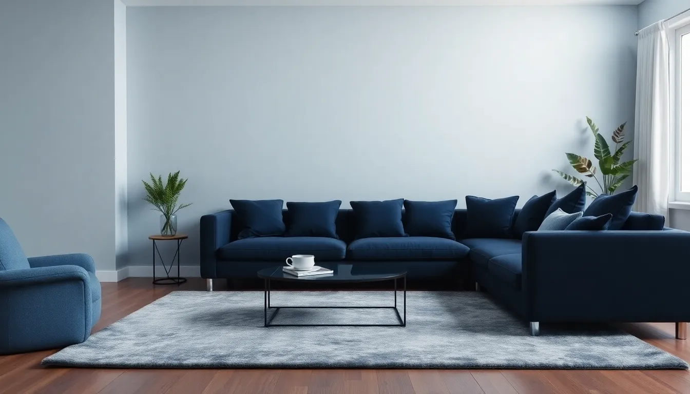
Monochromatic Schemes
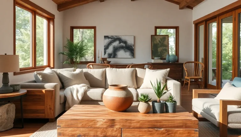
Monochromatic schemes utilize different shades, tints, and tones of one color. This simplicity creates a harmonious and cohesive look throughout a space. For instance, using varying hues of blue in a living room can evoke tranquility while maintaining visual interest. Designers often incorporate textures and patterns to enhance depth within this scheme. Real-life examples include soft blue walls paired with navy cushions, creating a serene vibe. A well-executed monochromatic palette provides elegance without overwhelming the senses.
Complementary Color Schemes
Complementary color schemes involve pairing colors from opposite ends of the color wheel. This technique creates striking contrast and visual excitement in any interior space. An example includes combining blue and orange, where both colors balance each other while creating a lively atmosphere. Interior designers frequently use this approach in dining areas, making them more inviting. It’s essential to manage the intensity of the colors to avoid overwhelming the space. A well-balanced complementary scheme boosts energy and liveliness in the room.
Analogous Color Schemes
Analogous color schemes consist of colors that are next to each other on the color wheel. This scheme creates a serene and comfortable atmosphere in interior spaces. For example, blending greens, blues, and teals can enhance a calming aesthetic in a bedroom. Designers often implement variations in saturation and brightness to maintain visual interest. Spaces decorated with analogous colors promote a sense of unity and cohesiveness. This approach is particularly effective in nurseries or relaxation areas, providing a soothing environment.
Choosing the Right Color Scheme
Selecting an effective color scheme can transform a space dramatically. It’s essential to consider various factors during this process.
Assessing Your Space
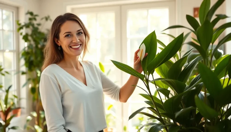
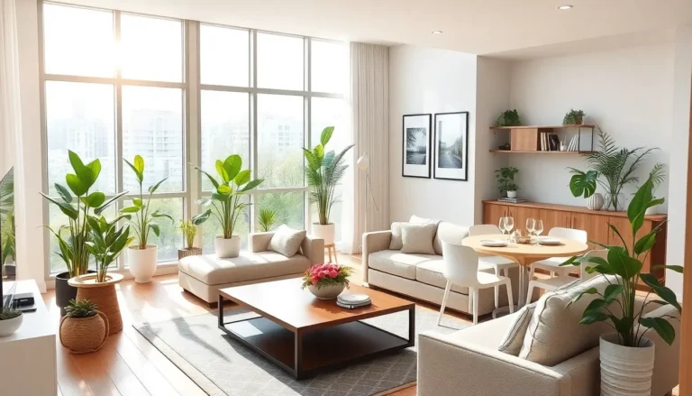
Start by evaluating the room’s size and layout. Small spaces often benefit from lighter colors that create an airy feel, while larger areas can handle bolder hues for a dramatic effect. Take note of existing furnishings and decor, as these elements influence color choices. Using accent walls can create focal points, adding interest without overwhelming the room. Consider how color harmonizes with textures and materials to enhance the overall aesthetic. Each area serves a purpose, so align color decisions with the intended function of the space.
Considering Lighting Conditions
Lighting plays a crucial role in color perception. Natural light shifts colors throughout the day, affecting how they appear in a room. Cool lights can make colors look more vibrant, while warm lights can soften tones. Testing color samples in different lighting throughout the day assists in making informed decisions. Artificial lighting types, such as LED and incandescent, also impact colors; incandescent light often adds warmth, while LED can enhance cool tones. Understanding these dynamics ensures the colors selected complement the room’s lighting effectively.
Tips for Implementing Color Schemes
Implementing color schemes involves thoughtful techniques and strategic accessorizing. Effective application enhances the overall aesthetic of a space.
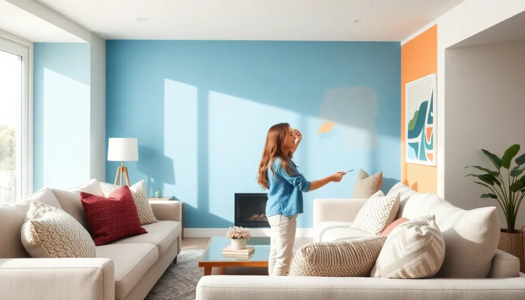
Painting Techniques
Consider a variety of painting techniques for visual impact. Techniques such as sponge painting or stenciling add unique patterns and textures to walls. Using a subtle ombre effect creates a gradual transition between colors, bringing depth to the room. Additionally, accent walls provide a focal point, highlighting specific areas of interest. Ensuring that colors complement existing decor prevents clashing and maintains harmony. Testing sample colors on the wall helps visualize their effect in different lights. Combining finishes, like matte and glossy, can also enhance the dimensionality of surfaces.
Accessorizing with Color
Accessorizing effectively supports a cohesive color scheme. Start with curtains and throw pillows, as their colors can unify a space. Select artwork that incorporates the chosen palette to reinforce the theme. Adjusting area rugs to include key colors adds warmth and texture to the room. Decorative items, such as vases or books, can introduce pops of complementary colors for visual interest. Lighting fixtures can influence color perception, so choose them carefully to enhance the ambiance. Regularly updating accessories allows for seasonal refreshes while maintaining overall design consistency.
Choosing the right interior color scheme can elevate any space and create the desired ambiance. By understanding the psychology of color and applying basic color theory, anyone can transform their home into a haven that reflects their personality and lifestyle.
Whether opting for a calming monochromatic palette or a vibrant complementary scheme, the key lies in thoughtful selection and implementation. Testing colors in different lighting and considering existing decor can ensure the final result is cohesive and inviting. With a little creativity and strategic accessorizing, it’s possible to breathe new life into any room, making it not just visually appealing but also a true reflection of one’s style.